The National Council of Social Service (NCSS) website is poised for a transformation to enhance user experience and brand consistency. NCSS is set on streamlining the navigation structure ensuring users can find what they need effortlessly, introducing more dynamic features on the home page will engage visitors more effectively, and highlighting critical information in an appealing way.
NCSS also planned to revamp the content with a coherent tone of voice and concise paragraphs, harmonising image styles, icons, and infographics with the brand, and optimising the use of brand colours so that the website can achieve a cleaner, more readable, and visually appealing look. These improvements aim to collectively elevate the NCSS website, making it a more user-friendly and cohesive platform that effectively represents the brand.
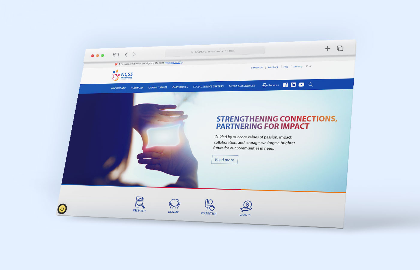
Mashwire was tasked to restructure the National Council of Social Service (NCSS) website, making the navigation structure more intuitive, and including dynamic content that engages with visitors, as well as standardising the tone of voice and style to be appealing, engaging, and consistent for the target audience.
Firstly, we began by integrating SEO keywords across more than 400 pages, making it easier for users to find key information.To improve content coherence and reduce excessive length, we rewrote the copy throughout the site, creating a consistent and engaging tone. We simplified the website's complex navigation by reducing layers and enhancing the user journey. The design of icons and infographics was unified to align with NCSS's brand identity, and the image style was updated to be more consistent.
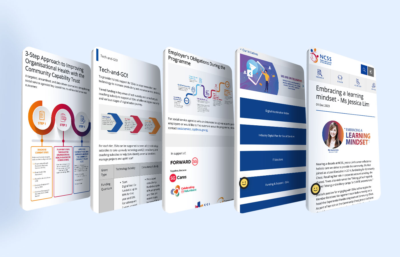
To reduce clutter and improve readability, we toned down the use of heavy brand colours. Enhancements were made on the inner pages focused on improving content organisation and making the layout more user-friendly.
These solutions resulted in a more engaging and user-friendly website, with clearer navigation, consistent branding, and a tone that resonated with NCSS's mission. The revamped website provided a better user experience overall due to brand consistency, as well as more intuitive design of the website.
June 2024

